CSS: How to get the masked text effect from the Apple iPhone XR promo pages
I am a sucker for cool typography effects.
As most “geeks”, I was aware of Apple’s event this week, where they announced (among other stuff) some new iPhones.
When checking out the promo website for the new iPhones, some of the text and design caught my eye. I couldn’t remember immediately how it was done, so I thought it would be a fun opportunity to (re-) learn/visit a technique, and maybe write a little breakdown.
And here we are!
The Effect
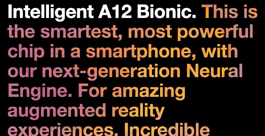
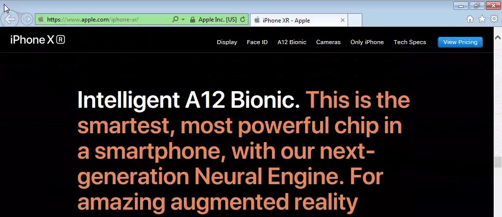
There’s a couple things I want to point out, but first, here’s the effect in question, as it appears on the promo page for the iPhone XR:
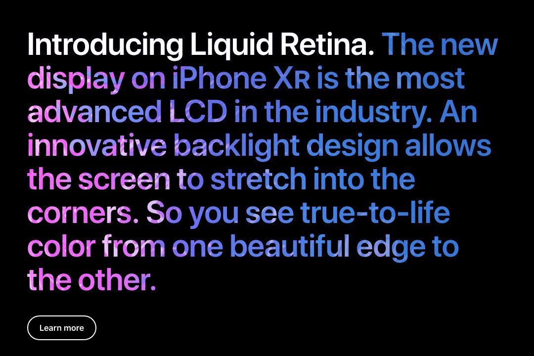
It’s got:
- Cool textured/colored “masked” text. It’s not an image!
- Some text that’s not masked, that appears to be in the same paragraph.
TL;DR
If you wanna skip right to the code for the first example, here’s the CodePen where I first broke down the effect as they used it:
See the Pen Apple iPhone RS masked text effect by tommy (@tommygeorge) on CodePen.
Figuring it out
The first thing I did was pop open the Dev Tools and find out what was going on. For some reason, I was expecting something a bit more complicated, but I still want to break it down.
The innermost parts
Inspecting the actual paragraph, I noticed that it’s actually made of two things: an h2 (heading tag)
followed by a regular paragraph (which is the text with the cool textured effect).
This screenshot of the dev tools is a little noisy, but I highlighted the important parts that we’ll talk about first…
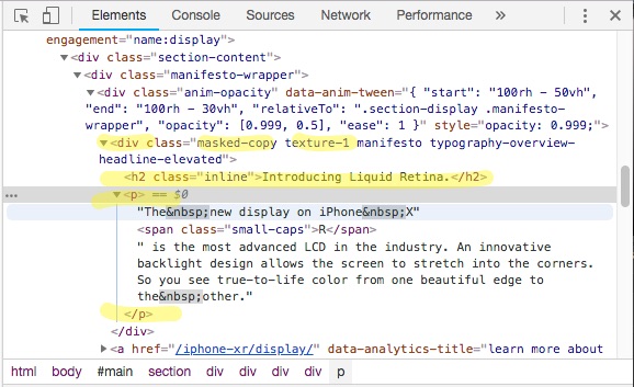
Namely:
- There’s a containing
divwith a couple of interesting class names:masked-copy, andtexture-1. Both good clues. - The heading tag has a class of
inline, which does exactly what you might think. - The actual text paragraph.
The container and its’ background
That texture-1 class defines the color, and a particular “background image” that
will be used for the paragraph(s) inside. I’m going to rename it for our
examples, hopefully to make it a little more clear. It’s defined something like this:
.texture-orange {
    background-repeat: no-repeat;
    background-image: url('path/to/texture-orange.jpg');
}
Those background images are actually some seriously bright, colorful, taller-than-they-are-wide, swirly, gradient texture images. Assuming they’re still at the same URL, you can see one here.
Here’s a very small example of the kind of thing going on in that background image:

So, the container has a background image. We’ll come back to that!
The text color “fallback”
Next, I noticed that the paragraph had a color set by the texture-1 class – something in the neighborhood
of the background that would later be applied (in this case #e5895f for the
orange and purple texture/gradient). That color is overridden, however, by
the masked-copy rules, that specify a transparent “color” for the text. So
far, we have some rules that look like this:
.texture-orange {
    color: #e5895f;
    background-repeat: no-repeat;
    background-image: url('path/to/texture-orange.jpg');
}

.masked-copy {
    -webkit-background-clip: text;
    color: transparent !important;
}
At this point, I haven’t taken a close enough look to determine their particular
reason for using !important on that color rule. I didn’t notice any conflicting
selectors. Also, it’s not necessary for the example we’ll build up. So you can
ignore it in this case.
The important (no pun intended) thing to note here is that they provided a
solid color for the text, for browsers that don’t support the -webkit-background-clip: text rule…
background-clip, and -webkit-background-clip
This is where the magic happens!
This may be a simplification, but this rule tells the container to hide all parts of the background (image or color) except where the text is.
The background-clip property is defined on MDN like:
The background-clip CSS property specifies if an element’s background, whether a <color> or an <image>, extends underneath its border.
… and when using the (experimental) text value:
The background is painted within (clipped to) the foreground text.
Why the -webkit- prefix?
I’m definitely not the expert, and so far have only spent a little time looking this up. From what I could tell from the compatibility charts on MDN and “Can I Use…”, the version of background-clip, particularly with the text value, has better browser support when using the prefixed version. I could be wrong!
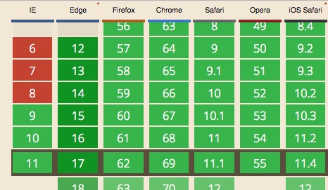
“Can I Use…” has this in the Note section for CSS3 Background-image options:
Firefox, Chrome and Safari support the unofficial -webkit-background-clip: text (only with prefix)
As well, I’ve seen this work fine on Windows machines, in IE11 and Edge.
Building our own
The final version of this is available in this CodePen.
Here’s the step-by-step build up to the final result.
The minimum structure
You only need a few things to pull this off:
- a dark background
- a container with a background color or image
- a nice header (optional!?)
- and the paragraph that will look awesome
Here’s the HTML we’ll work with (excluding the body and all that cruft):
<div class="masked-copy texture-orange big-type">
    <h2 class="inline">Intelligent A12 Bionic.</h2>
    <p>This is the smartest, most powerful chip in a smartphone,
    with our next-generation Neural Engine. For amazing augmented reality
    experiences. Incredible portraits with Depth Control. And speed and
    fluidity in everything you do.</p>
</div>
Adding CSS styles
First, our dark background. We’ll just make the body element have a black background color:
body {
  background-color: black;
}
To make it look similar to Apple’s design, we’ll need some chunky/bold text.
.big-type {
  /*
  These rules were copied almost wholesale from the
  Apple site CSS; I changed the font-stack to be more
  generic
  */
  font-size: 64px;
  line-height: 1.0625; /* The height Apple used to tighten up the spacing a bit. */
  font-weight: 600; /* Nice, chunky, bold! */
  font-family: "Helvetica Neue","Helvetica","Arial",sans-serif;
}
Now, rules to set the background image on our container, and set a solid color font that some older browsers will show, instead of the clipped background:
.texture-orange {
  /* Set the text color to a solid, in case our super cool effects don't work. */
  color: #e5895f;

  /*
  This is from the Apple styles.
  A word of caution: if your background image isn't at least as wide as
  your container, leave this off! Otherwise, it will hide text that
  falls outside of the background image.
  */
  background-repeat: no-repeat;
  /* You'll provide the URL to your texture background here. */
  background-image: url('/path/to/texture-orange.jpg');
}
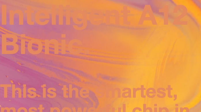
At this point, it’s probably looking something like this:
As they did, let’s make that header white. And while we’re at it, notice one of my favorite touches in this design: semantically, there’s a header and a paragraph. Visually, they pull the two together by changing the display property on the header and the paragraph elements from the default block to inline.
That change has to be applied to both elements.
.masked-copy p {
  display: inline;
}

.masked-copy h2 {
  color: white;
  display: inline;
  /* Get the font sizes and other features from those set on the parent */
  font: inherit;
}
Without the background-clip and color: transparent rules, you should see something like this:
Then, adding color: transparent, you’ll see the paragraph disappear…
.masked-copy {
  color: transparent !important;
}
Finally, the star of the show, applying the -webkit-background-clip: text rule will cause the background image of the selected element to be “clipped”, except for where the text exists, allowing the background-color of the body element (or another container) to show through:
.masked-copy {
  -webkit-background-clip: text;
  color: transparent !important;
}
Final code
All available in this CodePen, and here for posterity:
HTML
<div class="masked-copy texture-orange big-type">
  <h2>Intelligent A12 Bionic.</h2>
  <p>This is the smartest, most powerful chip in a smartphone, with our next-generation Neural Engine. For amazing augmented reality experiences. Incredible portraits with Depth Control. And speed and fluidity in everything you do.</p>
</div>
CSS
body {
  background-color: black;
  width: 900px;
}

.big-type {
  /*
  These rules were copied almost verbatim from the
  Apple site CSS; I changed the font-stack to be more
  generic
  */
  font-size: 64px;
  line-height: 1.0625; /* The height Apple used to tighten up the spacing a bit. */
  font-weight: 600; /* Nice, chunky, bold! */
  font-family: "Helvetica Neue","Helvetica","Arial",sans-serif;
}

.texture-orange {
  /* Set the text color to a solid, in case our super cool effects don't work. */
  color: #e5895f;

  /*
  The Apple stylesheet supplies a `background-repeat: no-repeat;` rule here.
  You can do the same, as long as your background image
  is at least as large as your text will be. Otherwise,
  text that falls outside of the background image will be
  invisible, and that's (usually) not what you want!
  */
  /* background-repeat: no-repeat; */

  /* You'll provide the URL to your texture background here. */
  background-image: url('/path/to/texture-orange.jpg');
}

.masked-copy p {
  display: inline;
}

.masked-copy h2 {
  color: white;
  display: inline;
  /* Get the font sizes and other features from those set on the parent: */
  font: inherit;
}

.masked-copy {
  /* This is it! */
  -webkit-background-clip: text;
  color: transparent !important;
}
Final thoughts
Using a regular background image isn’t the only way to go! You
can just as easily do it in pure CSS by providing a gradient background. That would also eliminate any accidental text clipping oddities that might occur if you use no-repeat backgrounds, etc.
See the links in the references below for more examples using background-clip.
Also, don’t be afraid of the -webkit prefix! This property has fantastic browser support, as mentioned before.
And remember that “fallback” text color?
Here’s a shot of good ol’ IE 9, on Windows Vista…
You can see the font in the “fallback” color, and no background. Not bad!
References
I am so late to this party! This effect has been really well covered in a few other places, at least as early as 2013!
- Divya Manian covered the effect, and alternatives, in fewer and better words than I could, back in 2013!
- Of course, CSS Tricks has “How To Do Knockout Text”
- MDN CSS docs on
color, becausetransparentis apparently an option. - Can I use… CSS3 Background-image options. Browser support is pretty great!
- The CodePen I made to accompany this post.